Before and After Planting Design
See examples of landscapes that were transformed with proper planting designPlanting design can make or break a landscape. Having the right plants in the right places is not only pleasing to the eye, but also ensures that the plants will thrive. Often when homeowners tackle planting design themselves they end up with a pieced together look that lacks cohesion. Check out the before and after examples below to see how landscape designers from across the country have helped homeowners tackle their planting problems.
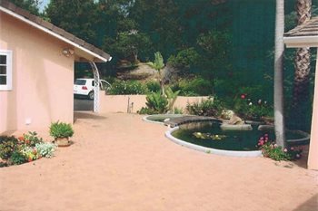
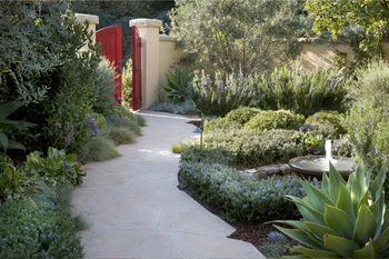
Bland Entry Becomes Inviting Courtyard
Dominated by wall-to-wall concrete, a dated pond and disjointed plants, this courtyard space was not living up to its potential. The owners wanted to screen their home’s plain architecture and requested that there be no lawn. Garden designer Alida Aldrich planned out a calming and intimate entry garden that is both lush and low-maintenance. The plants used have a limited color palette and a pleasing scent.
Project submitted by Alida Aldrich Landscape Design in Santa Barbara, CA.
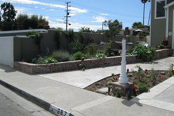
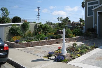
From Discord to Harmony
While the owners of this Southern California property had filled this brick planter running along their driveway, there was a feeling of discord. Like many homeowners, they had taken a one of everything approach, resulting in an odd mixture of edibles, perennials, vines and other plants. Landscape designer Rama Nayeri helped transform the raised planter with a harmonious planting design. Now the planter has a unifying balance of color, texture and form.
Project submitted by Creations Landscape Designs in Tustin, CA.

 Backyards
 Front Yards
